Color Palette
Primary Colors
Secondary Colors
Usage Guidelines
Accent Color
Use #c8f03c for primary CTAs, key interactions, and brand emphasis. Keep contrast ratio at least 4.5:1 for accessibility.
Text Contrast
Off-white on black for maximum readability. Gray text for secondary information, always maintain minimum 4.5:1 contrast.
Backgrounds
Use pure black (#080808) for main backgrounds. Off-black (#0e0e0e) for cards. Dark (#141414) for section variations.
Typography
Font Families
Bold, distinctive, all-caps headings. Letter-spacing: 0.05em to 0.12em
Clear, readable body text. Line-height: 1.6 for optimal readability
Technical, monospace font for UI elements, dates, and labels. Letter-spacing: 0.1em to 0.2em
Size & Scale
H1 (Page Titles)
clamp(40px, 6vw, 72px) | Bebas Neue | Letter-spacing: 0.02em
H2 (Section Titles)
32-36px | Bebas Neue | Letter-spacing: 0.03em
Body Text
16-18px | DM Sans | Line-height: 1.6-1.8
Labels
10-12px | DM Mono | Text-transform: uppercase
Brand Voice
Our Voice
Direct, authentic, and conversational. We speak to serious AI practitioners with respect for their intelligence and experience.
Be specific - Use concrete examples and India-focused context
Be honest - Acknowledge challenges and tradeoffs
Be direct - Say what you mean without jargon
Be confident - We know our audience and what we offer
Use hype - No overselling or buzzwords
Be vague - Specificity builds credibility
Over-explain - Trust the reader's intelligence
Sound corporate - Keep it human and real
Logo & Wordmark
Logo Usage
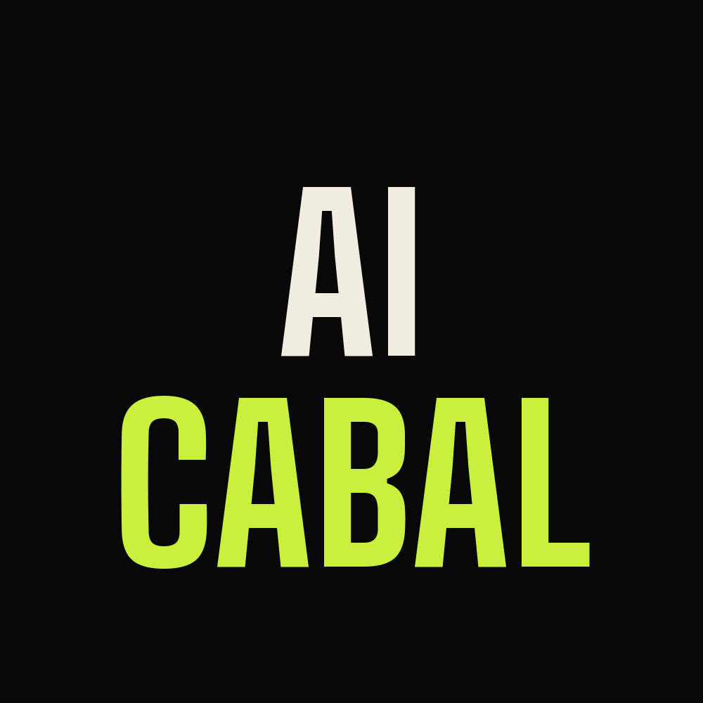
The AI CABAL wordmark should always have the accent (lime) color on "CABAL" for brand recognition. Always maintain clear space around the logo equal to the height of one letter.
Light Background
Use dark wordmark with lime accent on "CABAL"
Dark Background
Use light wordmark with lime accent (preferred)
Minimum Size
22px for web, 1 inch for print
Logo Don'ts
Don't Distort
Never stretch, squeeze, or rotate the logo
Don't Change Colors
Always use the official color palette
Don't Modify
Never add effects, shadows, or outline strokes
Buttons & CTAs
Button Styles
Primary Button
Background: #c8f03c (Accent)
Text: #080808 (Black)
Font: DM Mono, 12px, uppercase
Clip-path: Angled corners
Secondary Button
Background: Transparent
Border: 1px solid #666
Text: #d4d0c8
Hover: Border & text become accent color
CTA Copy
Action-oriented, specific, and compelling. Always include an arrow or clear indication of direction.
Examples
✓ "Join the Cabal →"
✓ "Read the Post →"
✓ "Explore Events →"
✓ "View All Posts →"
Imagery & Visuals
Photography
Use high-quality, authentic imagery. Avoid stock photos that look generic. Show real people, real work, real conversations.
Illustrations
Keep illustrations minimal and functional. If used, they should serve a purpose (explain a concept, add visual interest) not just decoration.
Blog Images
All blog hero images should feature the brand colors (black background, lime accents where appropriate). No text overlays on images - use the blog layout to display text.
Download Assets

Documentation
Brand Guidelines
design.md - Full system documentation